My Goals

Get a degree in fine art, maybe even a masters... Study with a Master. Study Realism and abstract art. Paint in classical style in water color, oil and acrylic. Mae my own paint. Paint modern, abstract and surreal subjects in a classical way. Make social comment through art. Start an international woman's artists collective. Build a web site full of art resources. Do Collaborative art with women around the world. Show.

Tuesday, June 10, 2008

The fish WILL get their eyes.....

Water colour class...

First class...sort of like a Rorschach test, a mirror image of a horizon, experimenting with washes, and then adding tree detail and cleaning out the horizon line later...the colours are not my favourite but the effect is sort of cool no?
Second class, again experimenting with washes, and color mixing..can you tell I LOVE bright colours? And yes....the fish will get their eyes...
hmmm....

What I have been doing...My Mother's flowers...

Experimenting with acrylic paint and trying to render my first still life floral with drapery. This started with about 4 attempts in paint (which failed miserably), then it sat on my easel for about 4 solid days as a pencil rendering on oil paper while I toiled and toiled on it trying to get it just right...., thank goodness oil paper is so sturdy or I would have rubbed holes in it with my eraser.... I do love the colors though and I guess not too bad for first attempt... This is my first canvas, for an online class I am taking called organic backgrounds. I love it, though it feels more collage-y and crafty than masterly artist..the techniques are very fun though with layering and layering more stuff one over the other. It is only at stage 2 out of 5..so stay tuned.
This is a pencil drawing of a photo I took of a puppet from Asia that I loved that I pan to use as my focal element on the background above...
This is another canvas from the same class...again stage 2 out of 5...

Tuesday, March 11, 2008

And here is what I did today...

Here is the photo I was working from, I decided to try something a little more challenging with lots of foreshortening, and a slightly more dramatic pose. I must confess I cheated a bit as I used a few guide lines to help me get the proportions right.

Here is the charcoal outline, cleaned and lightly sprayed.


Then corrected and prepared for the watercolor wash.

The first wash not yet dry as you can see the paper buckling.

Once the watercolour is dry I begin to layer the charcoal, creating light and and dark at which point I can make any corrections that I am able to see. Then, I like to take a nice break and then come back to it, I ALWAYS see something glaring I did not notice, that is in dire need of repair...like this elbow...yikes

Ahhhh... that's better..! I also like to try to look at overall shading values to give it a realistic light dark balance. All done, what do you think?

Monday, March 10, 2008

Here is what I did yesterday..

A little more work with Charcoal and watercolor together...


The photo I chose to work with, I think it is gorgeous..no? I love the hand


First I decided this time to work a bit larger so this one will end up about 3'X4'. So, the first step is to do a rough sketch of the form in charcoal, just lightly, get the form right, then you clean it by gently flopping it with a soft cloth, like dusting, but not rubbing, then set it lightly with a fixative spray.

Then you do a soft wash with a watercolor deepening the shadows and leaving highlights, and then let it dry.
Keep layering the water color progressively getting darker, until you have a contour you like and then let it dry.


Once the work is dry start adding more charcoal lighter and finer first and then finishing with darker accents, remembering to look at shadows.

This is the end result.
What do you think?

Thursday, March 6, 2008

Ok, SO YES, I DO have a great big creative fire burning under my behind...

And some more new things...

This is another portrait attempt using the same technique as the last one (layers of watercolour washes), using another B/W portrait from my book, and this is the rendering,I tried to be a little looser in my style and not be so "illustrator" It looks a bit better I think thought I have still made some obvious errors regarding the shape of the face, and it could use a little more work on the high and low lights. It is amazing how obvious things become in a photo or mirror while it is sometimes tough to see when it is right in front of you! I guess it sort of looks like maybe his brother or dad...

This next is what I did in class yesterday, a first attempt at a charcoal sketch with an overlaying wash of water color.

Not bad, though I was working from another piece of artwork while I would prefer a model or photo. After class I went and got some charcoal and some big paper so I can try a few at home this week... *Can't wait*!

I am sure my family will be thrilled...*Any one feel like getting nude?*

...*Just kidding!*
BTW I would really love any critical comments you have as a viewer, or artist, technical or any suggestions and please Be HONEST!! I would love to hear your ideas...besides nice stuff... REALLY!
SO what are YOU working on? Show me!

Wednesday, March 5, 2008

Some more fiddling with portraits

So this is the portrait I worked from, taken from a book of B/W portraits. Then using the watercolor technique I began in a rougher stage I started to sketch out the face shape and the depressions, and roughly the details, as each layer dried I began to define and redefine the features, mindful of light and dark. Not bad- but not an exact likeness... (I actually think he is cuter...) LOL!

This is a pencil sketch I did of Lily tired and sucking her thumb while watching TV...
*Sweetie pie!*
And these are two more experimental portraits taken from engravings on money, again with no pencil, only a brush...

More to come in a few days!!

Thursday, February 28, 2008

A little of this- and a little of that...

A few weeks ago, before the holiday, Torsten (that is my art teacher if you have forgotten) ushered me into the painting room in his 3 room studio, to where a large easel sat, already prepped with a large piece of white paper. He gestured to some brushes and a palette of water color paints. Then he rummaged around in a resource folder and produced some things for me to work from. Then he handed me the brush, and said...PAINT.

*You mean with no pencil sketches first?...gulp*
*With all these other people around to see my flub up*
*Perspire...what if it's a mess...or loos silly...perspire*

I was not prepared to work on the fly, with my usual calculated and planned style being the crutch...plus the entire idea of making something less than perfect...
Well ugh...*Oh goodness get over yourself girl....*. But Torsten continued to further gesticulate and encourage, while of course this all goes on in German just to further complicate matters...

SO this is what I ended up with at the very beginning ...
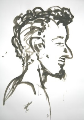
(Can you tell I was looking at Picasso's fawn ink drawings earlier in the day??) and I must say that while all of this intimidated the living H*ll out of me it was actually felt quite nice to be working only with paint...though I am finding that one of my biggest handicpas is loosing the "Illustrator" style to get things to be a bit more real... I'm workin' on it...
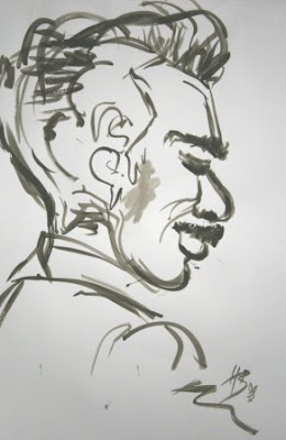
This is the version of anothe rimage free hand again in paint only, and the same image again below, but with a pencil sketch first and then several paint washes over top.

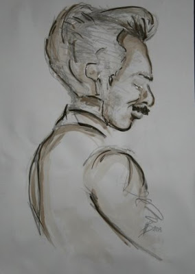
The secret it seems to me is to make all of your main lines very lightly in a wash and then to build the colour up refining the shapes as you go. At the end the guiding lines are virtually invisible, so if they were a bit off it is no problem. The beauty of water color if you are using good paper it is easy to lift ant excess color off after the fact, even if it has already dried, with a little light pressure (cutips or TAMPONS work well go figure) and some water.
The next is a rendition of one of Torsten's pieces.
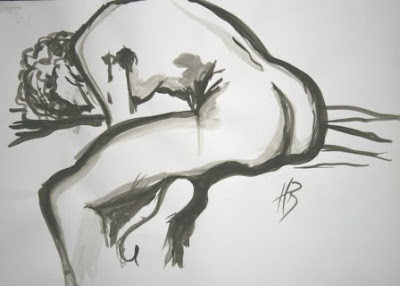
This next peice is something have been fooling around with for a while, wanting to experiment with my pen and ink a bit more, using the pen to do some really super fine detail, and then water color and some ink washes for shadow and depth...It was fun to fool around with the different things...it is called "Chronic Pain", and relates directly to my Prolotherapy experience, those having had prolo for chronic pain are the ones taking little ballons up up UP from the mountain and those for whatever reason didn't/couldn't/or wouldn't are decending to I know where not...sort of dark I know, but being free of pain is what enables me to do all of this!!! YAhhoooo!!!

Got some more watercolor portraits to show you tomorrow!! Check back in!!


Tuesday, February 5, 2008

Eric Fischl

A Later Addition ; in response to a question for Gary over at Withinsight who was wondering about the nature of these sculptures. The sculptures are life sized which adds to the effect and drama of them. Another interesting observation to note, and maybe something that may be more apparent to me as a non-local, the exhibit also included a figure in great physical distress being helped by a Samaritan, indeed the title of the piece called Samaritan, (you can see it at the back of the studio on the left in this photo) a very powerful piece, made me wonder if in fact this is not a nod to German War history, even thought the artist is an American.

The figures themselves appear to be made out of cast iron, and have a very weighty look, but upon reading about them further I discovered that in fact they are cast resin, and then presumably faux finished with various materials to resemble rusted iron, which in fact you can see Fischl doing if you follow the "Samaritan" link. The use of material finish lends them an air of permanence and weightiness physically and figuratively that I do not believe resin would have afforded.

Theses Went to a very cool sculpture exhibition at the suggestion of my art teacher, you can check it to here, famous American sculpture artist Eric Fischl...said with great reverence BTW...

I found the work to be raw and powerful.

It was exhibited at a somewhat obscure (well to me anyway... half tourist and half-walking-newcomer-that-I-usually-am) exhibition hall, but in the end, well turns out that his was my VERY LUCKY DAY.

I am sort of fishing around for some more art contacts, I would love to also do some life drawing, you know naked model who needs money poses for a group of wannabe artists...no but seriously a great way to improve your perception of anatomy, and proportion etc...we did several semesters of it in college (but were all so young and shy we had a hard time not giggling and googling ...goons...)


Any way at the gallery when I inquired about a newsletter in which I might post an ad the receptionist suggested I speak with the curator who might help me. Well if this kind, and of course, utterly elegant woman was not singly one of the sweetest and most helpful souls I have EVER had the good fortune of meeting well just knock me over with a paint canvas...


She not only went through some of the printed material in the reception area with me, but suggested several different avenues I might pursue, and proceeded to take down all my info and insist that yes of course we MUST stay in touch...and then 20 minutes into my visit of the gallery well up on the 2nd floor she huffing and puffingly proceeded to track me down rushing in with even more information that might be of use to me... well just bowl me right over...so very very kind...and at the very end of it all she had found an artist taking students to help them develop their portfolios...

*Gee Toto we don't seem to be in Kansas anymore...*


In any case the exhibit was very cool...what do you think?

Another topic entirely... is anyone else having trouble with spell check?

Saturday, January 26, 2008

My "Flexible Friend"...

With these...a present from TBG for Xmas bless his heart...

And with the help of this, my "Flexible Friend" (thanks to TBG's parents BLESS THEIR HEARTS!!!)

I have been able to work on THIS...

And THIS..

And THIS..


Wednesday, January 9, 2008

Update on the Villa in Pen and ink

Here it is...the final version.

It was really fun to experiment with the pen and all the different ways of using it. Rendering buildings, trees, roofing, stone walls, shrubs, and then later to add the 3 color washes, starting with a whisper of ink and then ending with a darker version. It looks a bit rounded and that is due to the camera lens.

I also realize that this would be great technique to use with water color. I think the color would really bring it to life.


The second piece is another freer technique and is a copy of a piece from Torsten's portfolio.
It is interesting how the photograph of the work brings out the faults and now looking at it I
would like to have another go at it. But ...I think I won't. Interesting tho and lots of fun. A real introduction for me as I have never worked with this Media and in this way.

Serious happiness...

Started my first day of the Wed A.M art classes. all went well , with the possible exception of a case of the inflating course fee, but...humumm... I am so all fired up about this it though a bit more than I had been previously told is still well more than ok.

So this morning when I arrived RIGHT AFTER re-hashing the fee structure again, granted in another language which always makes it a bit dicey, we began ...at the beginning... with EYES.

I say this because in my fashion illustration days I always...no matter what I was illustrating... I ALWAYS began with the eyes. Upper lids first, a set of thick and sultry lashes and then the irises, dark shaded and so smoky the pupils are indistinguishable, followed by a set of finely arched and artfully pencilled brows, an aquiline nose and thick matte red lips a-la-80's. Oooh I loved it...

...and then perhaps a sleek up-do, some dangly earrings, a sexy armpit and then the dress...a slinky curve revealing dress cut out of the finest jersey with a back cut down to there a touch of ruching over a flat belly and a shoulder pad, yes those Dallas shoulder pads, .... or perhaps a floating ball gown with a fur stole, an elegant pant suit with oh-so-strappy heels...Oriental satins, Thai silks, Italian brocades and French tulle, all opulent and gorgeous...ahh yes those were the opulent 80's...'

But wait I digress...

So this is what we began with today and it seems it DOES all begin with the eyes...

The examples...

and mine...